Ultimate Guide to CSS Gradients
Gradients are making a comeback, make sure you know how to use them
Gradients are back.
They are bold, eye-catching, and playful. When used correctly they can breathe life into a drab and lifeless design.
In this article, I’ll show you how to create gradients in CSS, so you can make your websites stand out.
What this article is about
This article aims to explain both the syntax and concepts behind CSS gradients. Topics covered include:
- Linear & Radial gradient syntax
- What are color stops
- Setting the direction of linear gradients
- How CSS angles work
- Changing the size, shape & position of radial gradients
But first, let’s get one thing out of the way…
Gradients are Images in CSS
For this reason, we need to set gradients as a background-image. You might think it’s obvious, but I had trouble remembering that at first.
I used to try and set gradients using background-color all the time. If you have trouble remembering this like me, use the background shorthand.
It lets us use the same property for colors and images. Including gradients.
Linear Gradients
A linear gradient is made up of two basic components: direction and color-stops.

Color Stops
Color stops define which colors make up the gradient and optionally, where to put them.
We can add as many color stops as we want. By default, they’ll be spaced evenly along the gradient line.
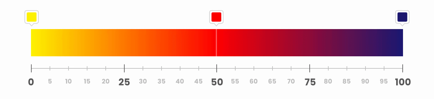
Color stops also allow us to set the starting position of each color manually. We do so by adding a percentage (with 0% being the start of the gradient and 100% its end ) after the color.
/* The GIF below animates between these 3 gradients */
background: linear-gradient(yellow, red 10%, blue);
background: linear-gradient(yellow, red 50%, blue);
background: linear-gradient(yellow, red 90%, blue);

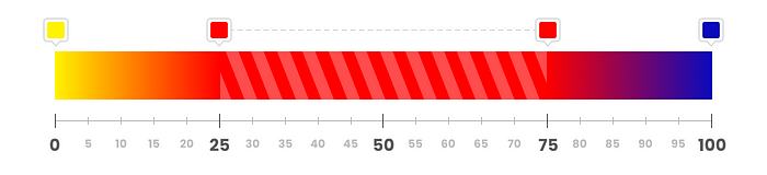
We can also set an ending position for a color, if we want a color to take up more space.
background: linear-gradient(yellow, red 25% 75%, blue);
Here are a few examples of manually positioned color stops:
/* Automatic Positions */
background: linear-gradient(lightpink, crimson, indigo);

/* Manual Starting Positions */
background: linear-gradient(lightpink 40%, crimson 50%, indigo 60%);

/* Manual Starting & Ending Positions */
background: linear-gradient(lightpink 0% 20%, crimson 35% 65%, indigo 80% 100%);

3 gradients with 3 color-stops. Each with different color-stop positions.
Direction
By default, a gradient goes from top to bottom.
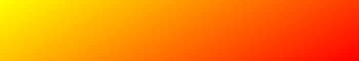
background: linear-gradient(yellow, red);

To get a gradient going from one side to the opposite side, write to *, where * is one of four keywords: top, bottom, left, and right.
For example: to left gives us a right-to-left gradient.
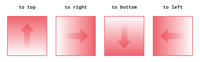
By using two keywords, we get a gradient going from one corner to the opposite corner.
For example: to bottom right gives us a gradient going from the top-left to the bottom-right corner.

If you need more precision than side-to-side or corner-to-corner, you can specify a custom angle.
CSS Angles
There are four different angle units in CSS, but we’re only going to focus on two: degrees deg and turns turn.
Degrees — a value from 0deg to 360deg, where 0deg = to top, 90deg = to right, etc.
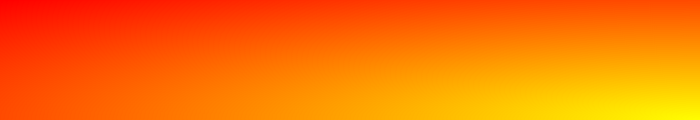
background: linear-gradient(150deg, yellow, red);
Turns are exactly what they sound like: 360 degree turns. This means that: 0.5turn = 180deg, 0.25turn = 90deg, etc.
There’s one thing you need to remember. CSS angles work differently than the ones you remember from school. They resemble a clock. Starting at the top and going clockwise.
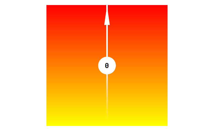
The gradient’s direction is indicated by the spinning arm. The corresponding angle in degrees is shown in the center.
Negative Angles
An angle can also be a negative number, like: -90deg or -0.25turn. Negative values represent counter-clockwise angles. So for example -45deg is the same as 315deg.
Radial Gradients
Radial gradients are different from linear gradients in one important way. Instead of progressing in a straight line, the colors radiate outwards from a single point.

The area of a radial gradient is defined by the origin point’s position, the ending shape, and its size.

The final area of a default radial gradient with 2 color stops: white and #F0626C
Let’s look at these three components in more detail.
Position
By default, the origin point is in the center of the element. We can change that by writing at *, where * is one or two length or percentage values indicating the origin point's coordinates.
/* These two declarations do the same */
background: radial-gradient(at 100% 100%, yellow, red);
background: radial-gradient(at bottom right, yellow, red);
background: radial-gradient(at 20% 70%, yellow, red);
Setting the origin’s position works exactly like the background-position property. You can read more about it in the article below.
Shape
By default, the gradient spans the entire area of the element. This means that if the element is not a square, the gradient will stretch and become an ellipse.
If we want the gradient to stay a circle — regardless of the container’s proportions — we need to set the gradient’s shape to circle.
background: radial-gradient(circle, yellow, red);
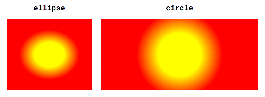
color-stop positions are adjusted in this example to better illustrate the differences
Size
The ending shape’s size is defined by where its edge meets the element.
Which part of the element? That can be set with one of four keywords: closest-side, closest-corner, farthest-side, and farthest-corner.
You can see all size & shape combinations below. The gradient area is marked using light ellipses and circles, and the 0% and 100% points are marked with a dark arrow.
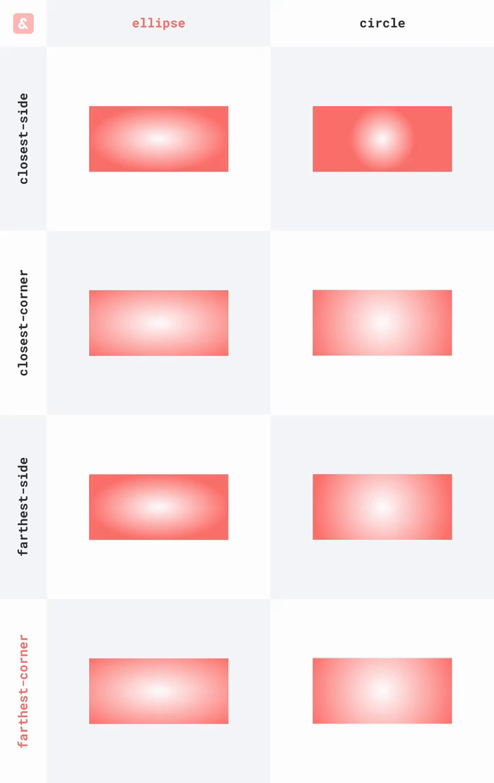
Even though farthest-corner and closest-corner might look identical, they produce very different results when the origin position is not in the center.
We can also specify an absolute value for the ending shape’s size, using a length value (radius) in case of circles and two percentages (horizontal and vertical radius) in case of an ellipse.
Putting it all together
We can combine changing the shape, size, and position. All three values make up the first parameter of radial-gradient(). That's why we only put one comma after them.
background: radial-gradient(circle closest-side at bottom right, yellow, red);
All three values are optional and default to: ellipse farthest-corner at center center.
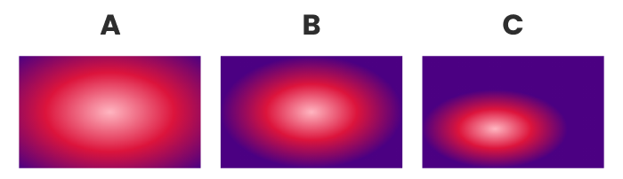
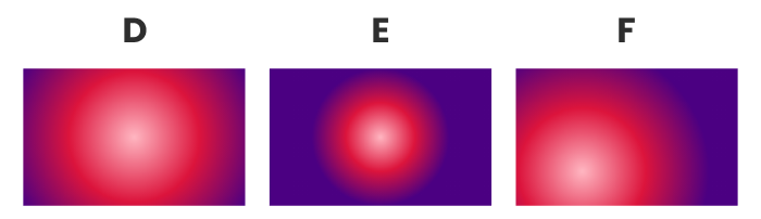
Here are a few examples, for you to get used to the syntax:
/* A */
background: radial-gradient(lightpink, crimson, indigo);
/* B */
background: radial-gradient(closest-side, lightpink, crimson, indigo);
/* C */
background: radial-gradient(closest-side at 40% 65%, lightpink, crimson, indigo);
/* D */
background: radial-gradient(circle, lightpink, crimson, indigo);
/* E */
background: radial-gradient(circle closest-side, lightpink, crimson, indigo);
/* F */
background: radial-gradient(circle 120px at 30% 75%, lightpink, crimson, indigo);
This should be enough to craft almost any gradient you want.