Gradient text in CSS
A simple technique for making eye-catching websites
It can be hard to make a website stand out.
So here’s a little trick that will improve any landing page or header: Use gradient text.
Just make sure to not overuse it. Gradients should never be used for longer text. Instead, use them to make headings or specific words more eye-catching.
What might surprise you — especially if you have prior experience with design tools — is that you can’t set a gradient as the text color directly. For example color: linear-gradient(yellow, red) won’t work.
But gradient text can be achieved in CSS, it just requires a few extra steps.
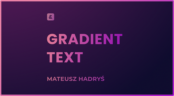
It’s best to start with some big bold text. This will make the gradient more visible and the text more readable.

The text I’ll be using is styled using font shorthand with the following values:
font: bold 120px Poppins, sans-serif;
Step 1: Add a Gradient
First, we need to add the gradient as a background.

By default, the gradient will go from top to bottom, but we can also specify a direction.
If you want a horizontal gradient, to right will do the trick, but a slight angle like 60deg looks more natural.
.gradient-text {
  background-image: linear-gradient(60deg, #E21143, #FFB03A);
}

If you want to learn how to create any gradient you want, or simply need a refresher, check out my Ultimate Guide to CSS Gradients.
Step 2: Clip It
Now we need to make the gradient only show where the text is. We can do that by using background-clip.
You can learn more about this and other background properties, in my article about all background properties.
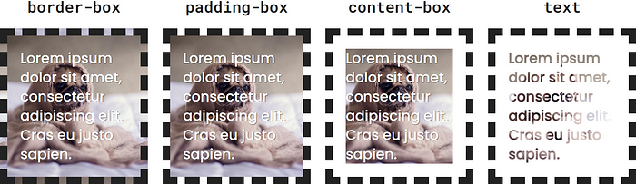
You might already know that this property lets us clip the background to the border, padding, or content box of an element.
But it can also clip the background to the text.
.gradient-text {
  background-image: linear-gradient(60deg, #E21143, #FFB03A);
  background-clip: text;
}
If you try this code, it will look like the gradient just disappeared. That’s because the gradient is under the text.
Step 3: Reveal It
To show the gradient underneath our text, we need to make the text transparent. We can do that by setting color: transparent.

.gradient-text {
  background-image: linear-gradient(60deg, #E21143, #FFB03A);
  background-clip: text;
  color: transparent;
}
You might be tempted to use the background shorthand here. Don’t.
Unfortunately, the background shorthand version of background-clip doesn’t support the text keyword.
Fallback
If you must support Internet Explorer, you’ll need to fallback to a flat color.
Wrap everything we’ve written before in an @supports rule. This way it'll only be rendered in modern browsers.
Then, outside of the @supports block, set a fallback color for the text. It should probably be a color that appears in your gradient and works well with the rest of the design.
/* fallback for IE */
.gradient-text {
  color: red;
}
/* gradient text for modern browsers */
@supports (background-clip: text) {
  .gradient-text {
    background-image: linear-gradient(60deg, #E21143, #FFB03A);
    background-clip: text;
    color: transparent;
  }
}
Make sure the fallback comes before the actual gradient styles.
NOTE: Even though the @supports rule itself is also not supported in IE, everything inside will still be ignored, which is exactly what we want.