Beautiful Custom List Styles Using Modern CSS
Learn to style list markers using the new ::marker pseudo-element

Lists don’t have to be boring.
And with the new ::marker pseudo-element, making them interesting doesn't have to be painful either. The browser support for this pseudo-element used to be spotty, but with its addition in Chrome 86, it'll soon be universal.
I’m going to show you how to make your lists stand out.
We’re going to cover:
- Built-in list styles
- Changing the color of list markers
- Emoji list bullets
- CSS counters
- Custom image bullets
- Fully custom list markers using
::before
Built-In Styles
Let’s begin by changing the look of list markers using the built-in styles. We do so, by using the list-style-type property. There are a few style options for both ordered and unordered lists to choose from:

These are just the most common options. The full list can be found on MDN.
Custom Styles
The ::marker pseudo-element lets us change the style of the list marker (bullet/number). using a subset of CSS properties. The allowed properties are:
- All
fontproperties (font-size, font-family etc.) coloranimationandtransitionpropertiesdirection,text-combine-upright,unicode-bidi- and
content
Let’s see what it can do.
🌈 Changing the Color
The most basic way to make your lists look better, is to change the color of the list markers. We can do that just like we would change the color of normal text.
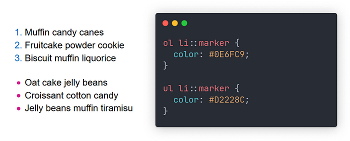
What if you need to support older browsers? You can apply the color to the li and wrap the text inside it in another element. Like this:
<ul>
  <li><span class="text-wrapper">Muffin candy canes<span></li>
  <li><span class="text-wrapper">Fruitcake powder cookie<span></li>
  <li><span class="text-wrapper">Biscuit muffin liquorice<span></li>
</ul>
ul { color: #0E6FC9; }
.text-wrapper {    color: black; }
Or create a fully custom marker with ::before. More on that later.
Custom Text
You might be thinking: Okay, but is changing color all that *::marker* can do?
No. Far from it. It lets us to change the content of the list marker, by using the aptly named content property.
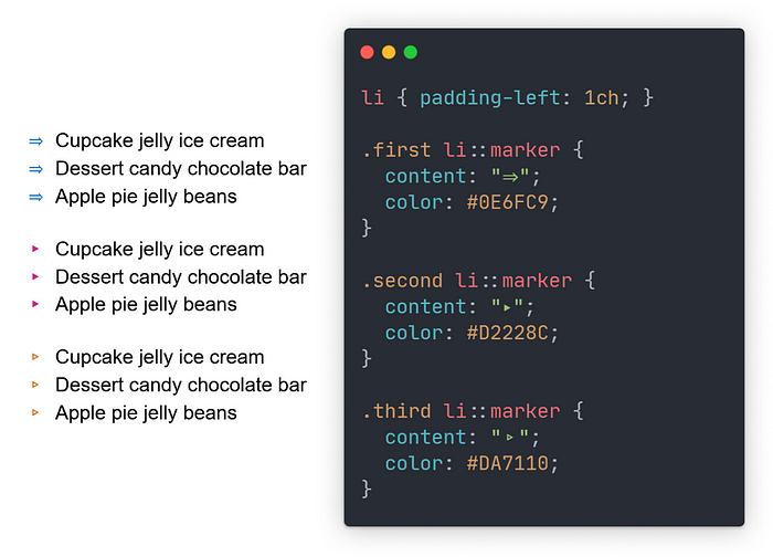
You can use any text as content, including Unicode symbols like the ones above or even emoji...
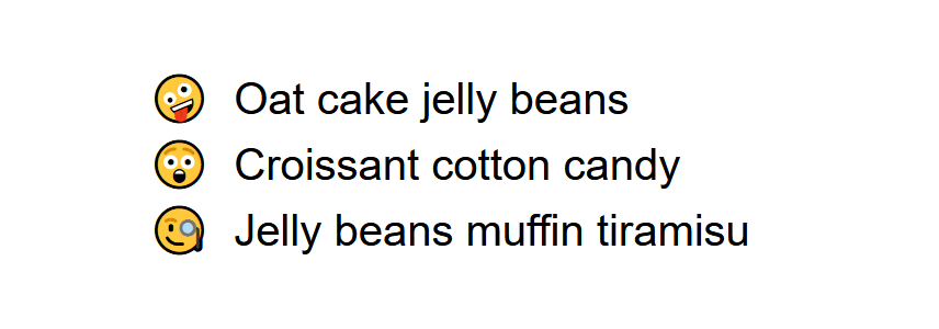
🔫 Emoji Bullets
As I said above, you can use emoji as list markers.
li::marker {
  content: "😁"
}
But you probably don’t want to use the same emoji for every list item. To fix that, we can set our emojis in a data-* attribute in HTML.
<ul>
  <li data-emoji="🤪">Oat cake jelly beans</li>
  <li data-emoji="😴">Croissant cotton candy</li>
  <li data-emoji="🤠">Jelly beans muffin tiramisu</li>
</ul>
And retrieve them in CSS using the attr() function.
li::marker {
  content: attr(data-emoji);
}
We can even change the marker’s content on hover using the :hover pseudo-class.
li:hover::marker {
  content: "🤯";
}
And here’s the result.
Okay, but what about ordered lists? Can we change their markers’ content like this?
Custom Ordered Lists
To change the content of an ordered list marker, we need to know which item it belongs to. We need to know its position in the list. That’s where CSS counters come in.
We need to create a counter on the list, and increment it on every list item. Then retrieve the current value of the counter using the counter() CSS function. We use the result of this function as the value of the content property.
/* Import fonts from Google Fonts */
@import url('https://fonts.googleapis.com/css2?family=Raleway&family=Sigmar+One&display=swap');

ol {
  list-style-position: inside;
  /* Start counter */
  counter-reset: list;
}

li {
  font-family: 'Raleway', sans-serif;
  /* Increment counter on each list item */
  counter-increment: list;
}

li::marker {
  font-family: "Sigmar One", cursive;
  /* Use counter to display the current number */
  content: "Step " counter(list) ". ";
}
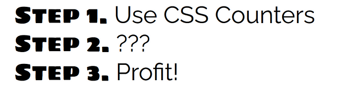
Let’s go through the code, to understand what’s happening.
We use counter-reset to create a new counter named list. The name is arbitrary and completely up to you. But why is the property called counter-reset? Because the counter is actually global and we need to reset its value on every list. That's why we have to set it on the ol and not the list items.
We’ve created our counter, but it’s useless if its value never changes. We need to increment it on every list item. To do that we set counter-increment: list; on our <li>'s.
Now that we have an auto-incrementing value, we use it in the content property of our marker. And here's where the magic happens. We can combine the value of our counter with other strings, optionally separated by whitespace.
A few notes:
- In the example, I imported some fonts from Google Fonts. It’s not necessary but I’m using it to distinguish between the list item’s content and the marker.
- Because the marker’s content in the example got pretty long, it was possible for it to go off the screen in some circumstances. That’s why I used
list-style-position: inside;to move the marker inside the list item's box. - You can put a number after the counter name to start from a different value. It would look something like this:
counter-reset: list 5;and the first three items of that list would have numbers 6, 7, and 8. - Counters can be used on any html element, not just lists.
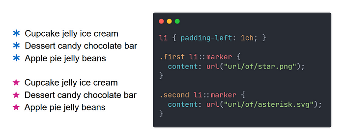
Custom Image Bullets
Okay, we can change the color, style, and text content of list markers, but what if we want something completely custom? We’ll have to use images.
To do that, we set an image as the marker’s content using the url() CSS function.
Fully Custom List Markers
If all of the above options still aren’t enough for you, there’s still one more option. One that allows us to do anything we want with our list markers. It’s more work and a bit of a hack, but it’s useful if all else fails.
We can use the ::before pseudo element to create our own markers. This method allows us to create custom backgrounds for our markers, easily scale image bullets and more.
Clear the defaults
Before we can create our own markers, we have to get rid of the default ones.
ol {
  margin: 0;
  padding: 0;
  list-style: none;
}
This gives us a blank canvas to work with.
Note: This can create accessibility issues, so you should add role=”list” to the list in your HTML
<ol role="list">
  <li>Latvia</li>
  <li>China</li>
  <li>Portugal</li>
</ol>
Create the marker
When using ::before you have access to all CSS properties and not just a subset like with ::marker.
You are however responsible for setting the marker’s content, spacing between the marker and the list item’s text, and proper alignment.
As an example, here’s how to create the objectively best-looking list of all time. Explanations are included in the comments.
@keyframes spin {
  from { transform: rotate(0deg); }
  to { transform: rotate(360deg); }
}

body {
  background: center/contain no-repeat linear-gradient(135deg, red,orange,yellow,green,blue,violet);
  color: red;
  font: italic bold 3.2rem cursive;
  text-shadow: 1px 1px black, 2px 2px black, 3px 3px black, 4px 4px black;
  letter-spacing: 3px;
}

ol {
  /* Remove defaults */
  margin: 0;
  padding: 0;
  list-style: none;

  /* Use CSS grid for spacing between list items */
  display: grid;
  gap: 20px;

  /* Create counter */
  counter-reset: list;
}

li {
  /* Use CSS grid for spacing between marker and list item contents */
  display: grid;
  grid-template-columns: min-content 500px;
  column-gap: 20px;

  /* Increment counter */
  counter-increment: list;
}

li::before {
  /* Set content to an empty string */
  content: counter(list);

  /* Add a background image for the marker */
  background: center/contain no-repeat url("path/to/image.png");

  /* Add animation */
  animation: 3s linear 1s infinite spin;

  /* Create the box and center its contents */
  width: 60px;
  height: 60px;
  display: flex;
  justify-content: center;
  align-items: center;

  /* Additional text styles */
  color: white;
}
The code above results in this:

A few notes:
- Using the background property for the marker’s image allows us to scale and adjust it more easily.
- If you want to create custom image bullets for an unordered list using
::before&background, you have to setcontent: ""in order for the marker to be rendered.
That’s all, you’re now a master of list styling.