All CSS Background Properties Explained in 5 Minutes
Quick, but Complete Introduction to CSS Background Properties
I remember when I first tried setting an image background in CSS.
What I thought would be a simple task took me down a rabbit hole of learning 8 different background-* properties. It
took me hours to figure out what they all did and how they interacted.
Now, I want to teach you everything you need to know about CSS background. In minutes instead of hours.
🎨 Color
Property: background-color
Default Value: transparent
The most commonly used background property. It lets us change the color of an element’s background.
The color can be specified using rgb, hsl or hex notation.
/* Without Transparency */
background-color:

rgb
(
0
,
0
,
0
)
;
background-color:

hsl
(
0
,
0
%
,
0
%
)
;
background-color: #000000

;

/* With Transparency */
background-color:

rgba
(
0
,
0
,
0
,
1
)
;
background-color:

hsla
(
0
,
0
%
,
0
%
,
1
)
;
background-color: #000000ff

;
You can also use one of the 140 predefined colors, or the transparent
keyword.
📷 Image
Property: background-image
Default Value: none
The star of the show. Almost all other background properties modify it in some way.
It allows us to set an image as the element’s background.
To do it, use the url() function with a relative or absolute URL as its parameter. The URL should be wrapped in
quotes " or apostrophes '.
NOTE: When you choose to go with a relative URL, remember that it’s relative to the stylesheet, not the webpage.
background-image:

url
(
"image.png"
)
;
But why can’t we just write the URL without some fancy function? Because there are other image sources in CSS. For example: gradients.
background-image:

linear-gradient
(
red, yellow

)
;
Yeah, gradients are images in CSS. If you find this hard to remember like me, use the background shorthand. It does the remembering for you 😄
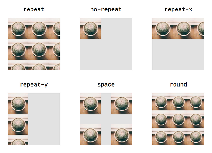
Repeat
Property: background-repeat
Default Value: repeat
background-repeat determines what happens, if the image is smaller than the element it serves as a background for.
The possible values of background-repeat are better shown than told:
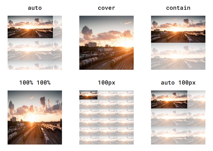
Size
Property: background-size
Default Value: auto auto
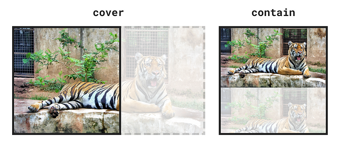
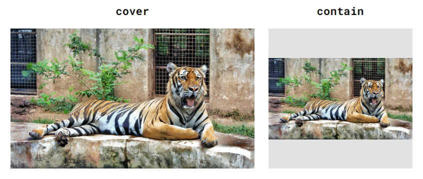
This property controls the size of the background image. Most of the time it’s used with one of two keywords:
cover- It fills (covers) the entire area of the element with the image, without stretching. Even if it means that parts of the image won't be visible.contain- The opposite ofcover. It makes sure that the entire image fits (is contained) in the element, without squashing.
Unless background-size is set to no-repeat, setting background-size: contain will result in image tiling.
The value of background-size can also be a percentage or length (px,cm,em etc.).
A percentage value is relative to the element’s size, or more specifically the area specified by background-origin.
More on that property later.
background-size can be set using a one-value or two-value syntax.
- When only one value is provided, it sets the image’s width. Height is set automatically to preserve proportions.
- When two values are provided, the first one sets the width, and the second sets the height.
When using two values, the image might get stretched. To prevent stretching, set one value using a length/percentage and
the other using the auto keyword.
250 x 125 image in a 300 x 300 box. The semi-transparent parts represent image tiling with background-repeat: repeat.
Position
Property: background-position
Default Value: 0% 0%
Maybe you’ve noticed that when we change an element’s size, it stays glued to the top-left corner. We can change that by
using background-position.
There are four keywords we can use: top, bottom, left, and right. As well as any length or percentage value.
Just like background-size, we can use a one-value or two-value syntax.
- When using one value, it sets the image’s horizontal (x-axis) position. The vertical (y-axis) position defaults to 50%.
- When using two values, the first sets the horizontal position and the second: vertical.
NOTE: Length values set the distance of the image’s top-left corner from the element’s top-left corner. Percentage and keyword values set the position of the image’s mid-point on a given axis.
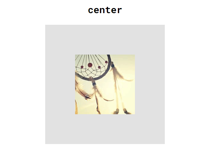
Combining background-position: center with background-size: cover or contain is an easy way to achieve responsive
images, that scale well with the element and the page.
📌 Attachment
Property: background-attachment
Default Value: scroll
background-attachment allows you to control how your background image reacts to scrolling.
Possible values are:
scroll- Scrolls with the page, but not with the element's contents.fixed- Fixed to the viewport. Acts like a window to something behind the page.local- Scrolls with the page and the element's contents.
If you’re confused by that, don’t worry. It’s tricky to understand without examples. Play around with the demo below until you get a better feeling for how this property works.
Origin
Property: background-origin
Default Value: padding-box
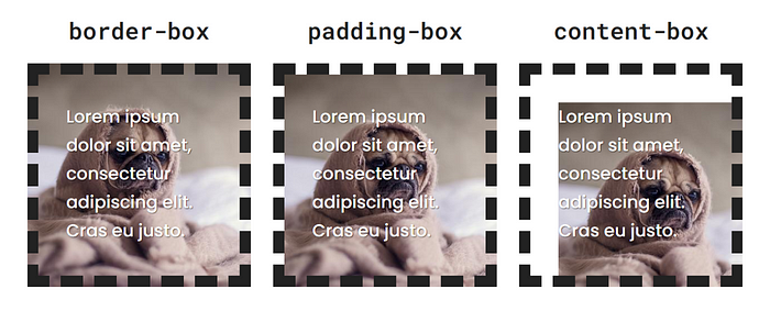
This property sets the background’s origin. It uses three keywords:
border-box- The background starts at the outer edge of the border. It goes under it, which you can see if the border is semi-transparent,dashed, ordotted.padding-box- The background starts at the inner edge of the border.content-box- The background starts where the element's content does.
This example assumes background-repeat: no-repeat;
Both background-position and background-size are relative to the box set by this property.
Clip
Property: background-clip
Default Value: border-box
Even though background-clip shares most of its values with background-origin and their results might look similar,
they are actually quite different.
This property doesn’t modify the position of the background in any way.
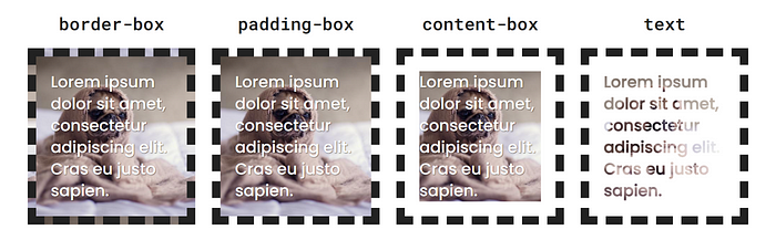
It clips the background to the selected box. This means that any parts of the background outside the area set by this property will not be visible.
border-box- The background is clipped to the outer edge of the border. It will be visible under the border, padding and content.padding-box- The background is clipped to the inner edge of the border. It will be visible under the padding and content.content-box- The background is clipped to the content area. It will only be visible under the element's content.text- The background will only be visible under the element's text content. Make sure to setcolor: transparentto see the background. This can be used to achieve some cool effects like gradient text.
NOTE: If the area set by
background-clipis smaller than the one set bybackground-originthe outer parts of the image will be cut off. Make sure there's nothing important there.
Layers
All background properties, except background-color accept multiple values, separated by commas. That's because every
element can have multiple background layers.
background-image:

url
(
cat.png
)
,
url
(
grass-texture.jpg
)
;
background-repeat: no-repeat, repeat

;
background-attachment: scroll, local

;
background-image: green

;
The first (leftmost) value corresponds to the top layer. The last (rightmost) value, is the bottom layer.
But managing layers across multiple properties can get messy pretty quickly. For example: What if you decide to add
another image layer at the top of the layer stack but forget to update other *background-** properties?
This problem can be prevented by using the background shorthand.
I hope this introduction made this topic easier to understand, and can serve as a reference, if you ever need a refresher.